Open
Description
Problem to solve
The new alert component introduced back in #8783 was the next iteration of the alert component improved for #7613.
InfoBox and AlertBox components to the new Alert component.
See also relevant discussion (internal).
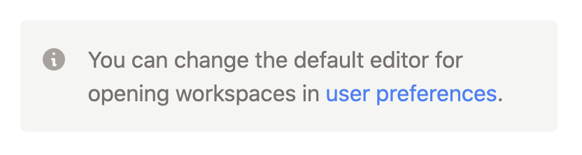
| Alert Component / Info Variant / Light Theme | Alert Component / Info Variant / Dark Theme |
|---|---|
 |
 |
| Alert Component / Warning Variant / Light Theme | Alert Component / Info Variant / Dark Theme |
|---|---|
 |
 |
Proposal
This issue acts as a placeholder for tracking these improvements and the next iteration of the alert component.
Thankfully, now that the new alert component is in place we will only have to update the designs in one place. 🔮
Designs
TBD (To be discussed)