Description
Problem description
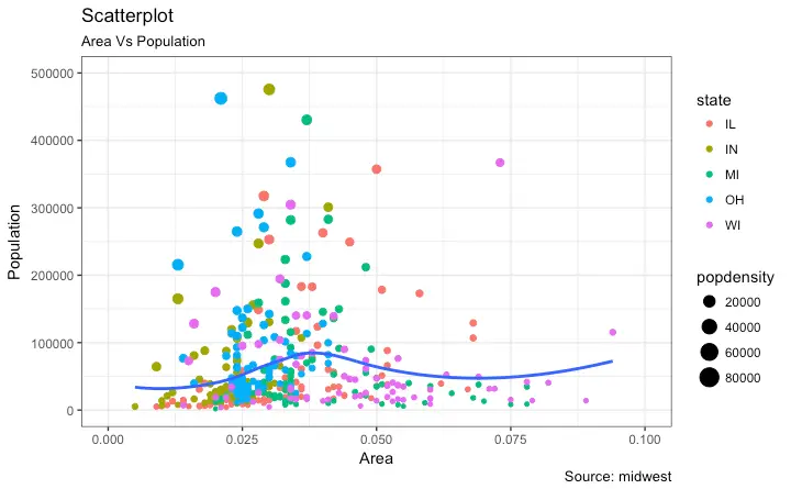
Use case: Say we have a df with 4 columns- a, b, c, d. We want to make a scatter plot, with x=a, y=b, color_by=c and size_by=d. Here, if c is a categorical, we get a discrete set of colours and corresponding legend, else a continuous scale. size_by decides the size of the marker.
Such cases are often needed as evidenced by questions on Stack Overflow.
Image below shows an example.
I wrote a blog post(hand-wavy at times- marker size legend) on how to generate such a plot in Pandas. The code below shows how to make a similar plot.
Code Sample, a copy-pastable example if possible
import matplotlib.pyplot as plt
import pandas as pd
midwest= pd.read_csv("http://goo.gl/G1K41K")
# Filtering
midwest= midwest[midwest.poptotal<50000]

fig, ax = plt.subplots()
groups = midwest.groupby('state')

# Tableau 20 Colors
tableau20 = [(31, 119, 180), (174, 199, 232), (255, 127, 14), (255, 187, 120),
             (44, 160, 44), (152, 223, 138), (214, 39, 40), (255, 152, 150),
             (148, 103, 189), (197, 176, 213), (140, 86, 75), (196, 156, 148),
             (227, 119, 194), (247, 182, 210), (127, 127, 127), (199, 199, 199),
             (188, 189, 34), (219, 219, 141), (23, 190, 207), (158, 218, 229)]


# Rescale to values between 0 and 1
for i in range(len(tableau20)):
    r, g, b = tableau20[i]
    tableau20[i] = (r / 255., g / 255., b / 255.)

colors = tableau20[::2]

# Plotting each group
for i, (name, group) in enumerate(groups):
    group.plot(kind='scatter', x='area', y='poptotal', ylim=((0, 50000)), xlim=((0., 0.1)),
               s=10+group['popdensity']*0.1, # hand-wavy :(
               label=name, ax=ax, color=colors[i])

# Legend for State colours
lgd = ax.legend(numpoints=1, loc=1, borderpad=1,
            frameon=True, framealpha=0.9, title="state")
for handle in lgd.legendHandles:
    handle.set_sizes([100.0])

# Make a legend for popdensity. Hand-wavy. Error prone!
pws = (pd.cut(midwest['popdensity'], bins=4, retbins=True)[1]).round(0)
for pw in pws:
    plt.scatter([], [], s=(pw**2)/2e4, c="k",label=str(pw))

h, l = plt.gca().get_legend_handles_labels()
plt.legend(h[5:], l[5:], labelspacing=1.2, title="popdensity", borderpad=1,
            frameon=True, framealpha=0.9, loc=4, numpoints=1)

plt.gca().add_artist(lgd)
This produces the following plot:
I was wondering, if the use case is important enough to introduce changes in the API for scatter plot, so that color_by and size_by arguments can be passed? I understand that the same set of arguments are used across different plots, and a size_by will not make sense for many plots.
If this will not make it into the API, it still might be useful to have a detailed example in the cookbook. Or, a function that would work out of the box for such plots.