Description
Code Sample, a copy-pastable example if possible
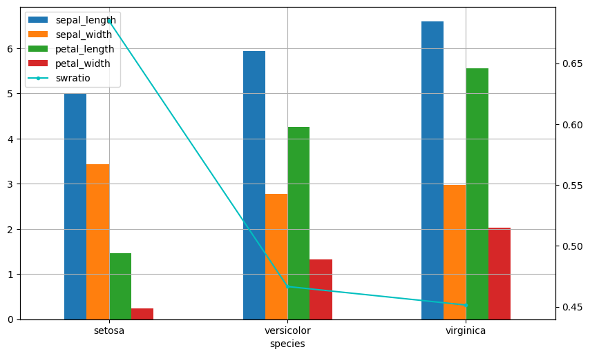
import pandas as pd
import matplotlib.pyplot as plt

df = pd.read_csv('iris.csv')
dfg = df.groupby('species').mean()
dfg['swratio'] = dfg.sepal_width / dfg.sepal_length

fig, ax = plt.subplots(figsize=(10, 6))
dfg[['sepal_length', 'sepal_width', 'petal_length', 'petal_width']].plot.bar(ax=ax, rot=0, stacked=False)
dfg[['swratio']].plot.line(label='Sepal Width Ratio',
                 ax=ax, secondary_y=True, mark_right=False,
                 rot=0, marker='o', markersize=3, color='c')
ax.grid(True)
pngfile = 'Output.png'
fig = plt.gcf()
fig.savefig(pngfile, bbox_inches = 'tight', dpi=100)
Problem description
dataframe.plot with secondary_y=True makes different chart between 0.23.4 and 0.25.0 as attached.

Note: We receive a lot of issues on our GitHub tracker, so it is very possible that your issue has been posted before. Please check first before submitting so that we do not have to handle and close duplicates!
Note: Many problems can be resolved by simply upgrading pandas to the latest version. Before submitting, please check if that solution works for you. If possible, you may want to check if master addresses this issue, but that is not necessary.
For documentation-related issues, you can check the latest versions of the docs on master here:
https://pandas-docs.github.io/pandas-docs-travis/
If the issue has not been resolved there, go ahead and file it in the issue tracker.
Expected Output
Output of pd.show_versions()
[paste the output of pd.show_versions() here below this line]